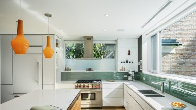
How a design team turned a dated, stuffy Rosedale condo into a luxe, airy space
When the owners bought their 1,200-square-foot low-rise at 40 Glen Road, they liked the original mouldings—and that’s about it. The stodgy decor, stuffy rooms and sad boxed-in kitchen didn’t suit them, so they enlisted EMME Design’s Elana Safronsky and Mia Rodak to adapt the layout for better flow. Today the condo exudes luxury—an impressive amount of it, considering the overhaul was done on a $60,000 budget.
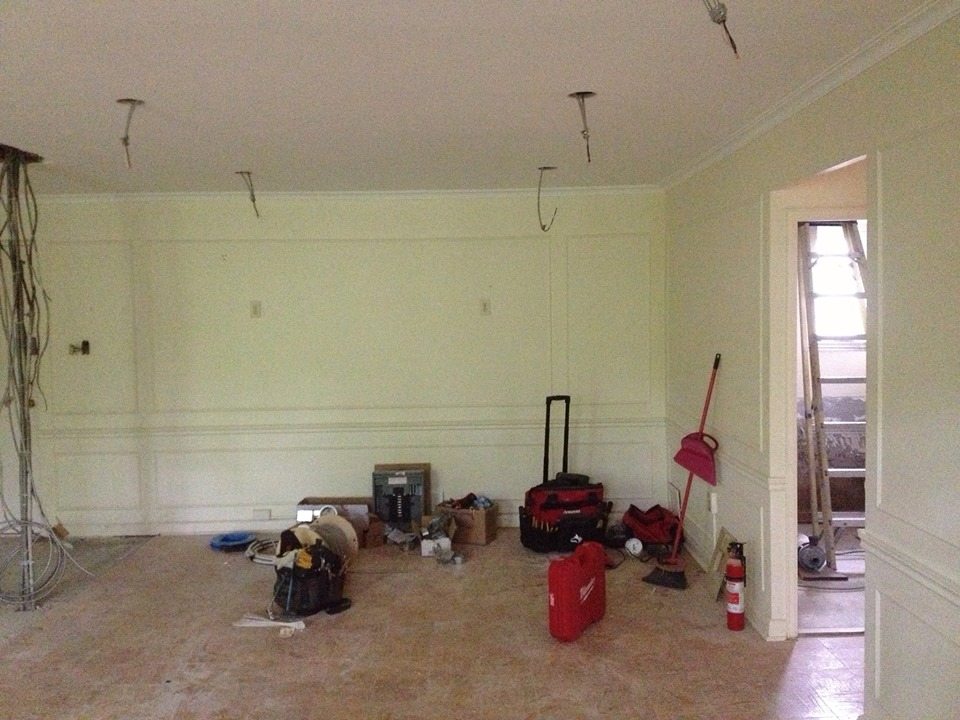
Here’s what the main room used to look like. To brighten the space, the designers added pot lights (previously, there hadn’t been any built-in lighting):
The master bedroom was total Drabsville:

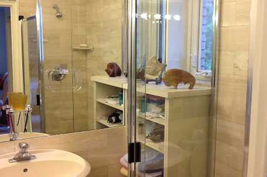
Water-stained travertine slabs covered the wall in the master bathroom, which was cramped and dull:
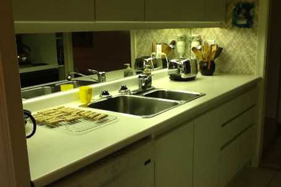
The old kitchen had dated melamine cabinets and depressing wallpaper:
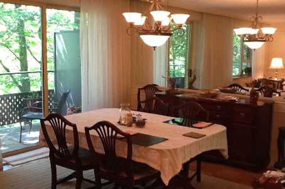
…not to mention a dim dining-room setup:
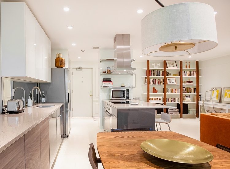
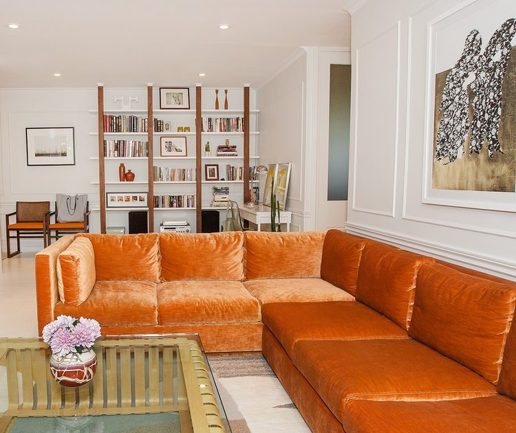
This is the main room now, with a low-slung orange velvet sofa custom-made by EMME Design. It feels decidedly retro, but in a good way. The velvet scene-stealer is modelled after a vintage Milo Baughman piece that sells for around $15,000. At $7,000, the knockoff ate up about 10 per cent of their budget, but was worth it, because it’s a focal point. The material is from Joanne Fabrics and Ideal Sofa constructed the couch:
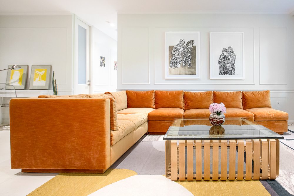
The front door is to the left of the two-toned bookshelf. The designers found a Frank Gehry Icing Table from the ’90s on Kijiji, and the glam, limited-edition print over the sofa is by the young Vancouver artist Meichen Waxer.
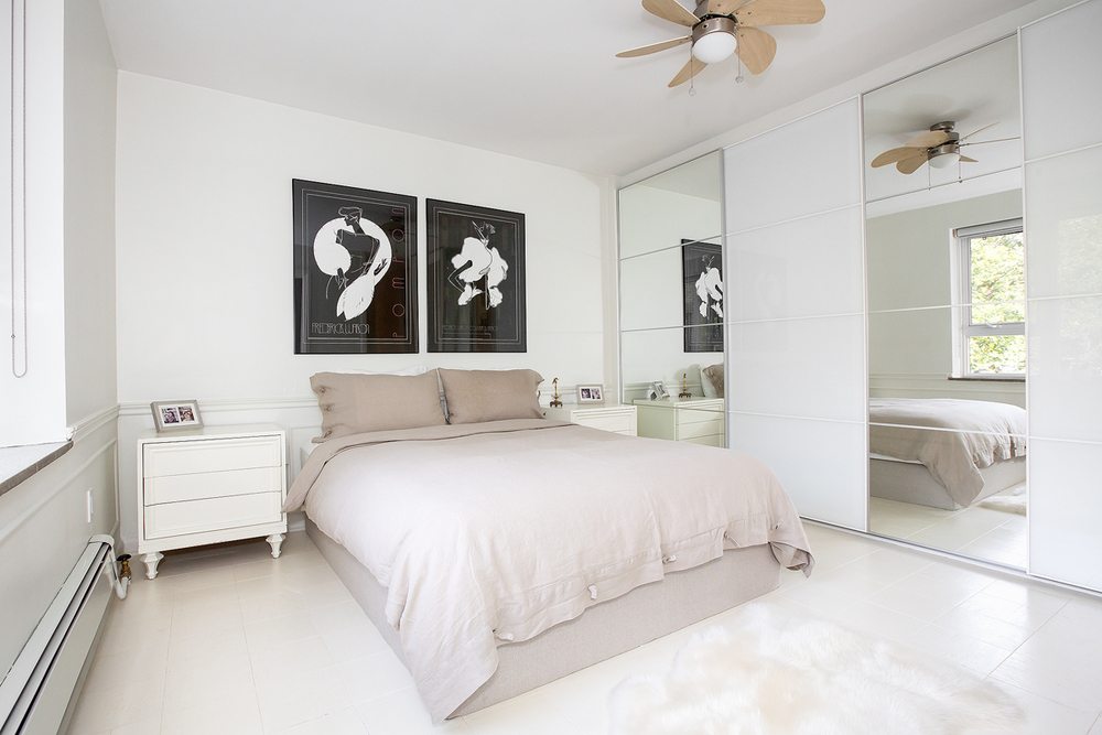
That drab master bedroom is now fresh and breezy with a recessed IKEA closet and lacquered art deco artwork that pops against the white walls:
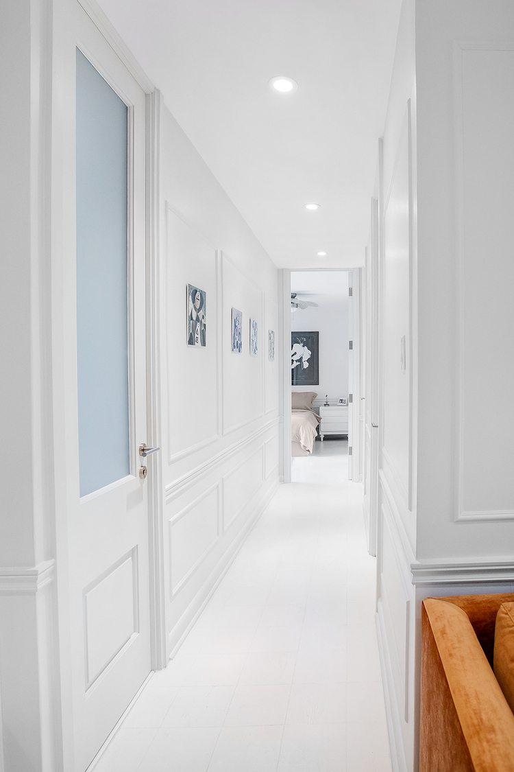
The hallway leading to the master bedroom was also refreshed. The designers enlarged the doorways to create grandeur and draw the eye upwards, swapped out the doors with ones that had frosted glass inserts to bring in more light, and painted everything white:
EMME enlarged the bathroom and replaced the water-stained wall tiles with fun, raised-penny tiles in an amber-pink hue (for more of that ’50s feel). “For the money, you get a lot of bang,” Safronsky says. The designers removed the shower (there’s one in another bathroom) and went with a deep bathtub instead. They added a floating vanity and double sinks from IKEA:
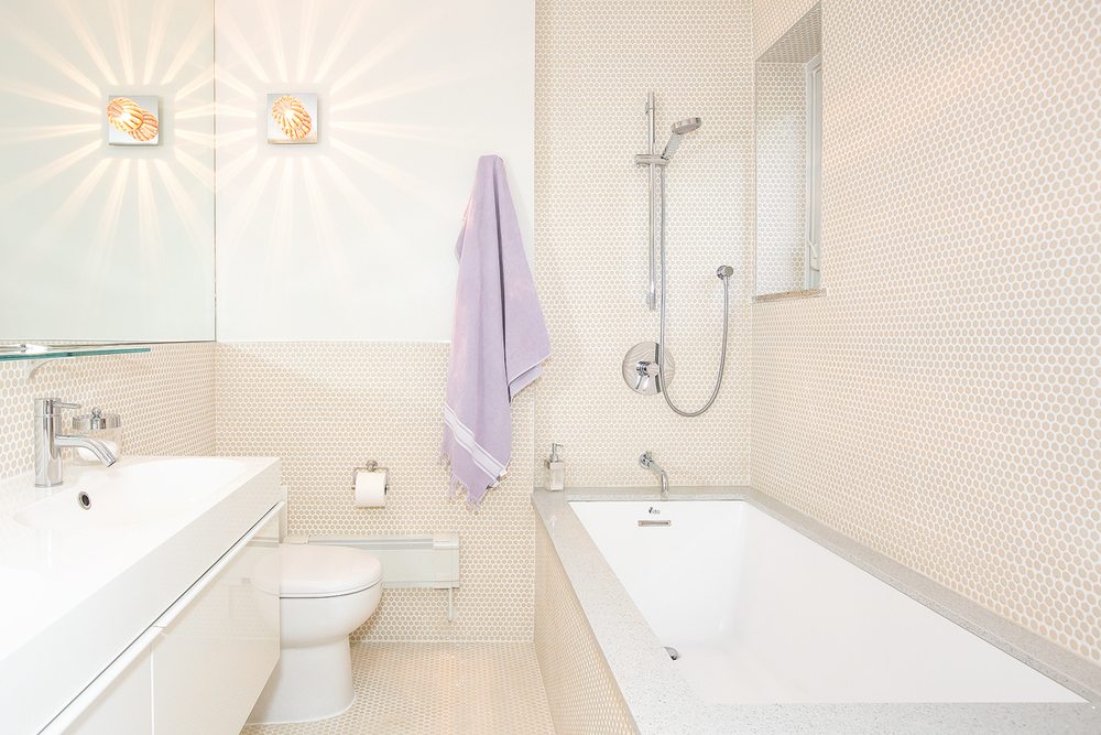
Here’s another view of the bathroom. The chrome-and-lucite sconce (this is one of two) comes from Union Lighting:

Here’s what the kitchen looks like now. The designers knocked out some walls and colour-blocked the kitchen to set apart the space: the grey area corresponds with the dining room; the bleached-oak space goes with the kitchen; and the top cabinetry is white and inconspicuous. “Because it’s open-concept, we didn’t want the kitchen space to look too kitchen-y,” Safronsky says, “so no tiles or hardware on the cabinets.”
