Meet the designers behind some of Toronto’s most eye-catching beer labels
The popularity of a local beer depends on how it tastes, but when it comes to browsing the bottle shop, what’s on the outside counts, too. Here, the folks behind some of Toronto’s coolest labels discuss their art
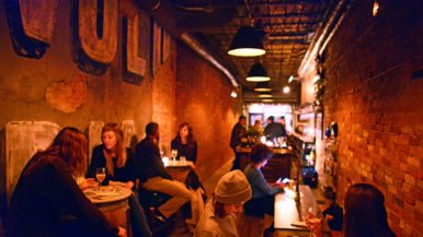
Bellwoods Brewery
Matt McCracken, graphic designer and owner of Doublenaut

“For three years we operated out of offices on the second floor of Town Moto on Ossington, so we were right beside Bellwoods. We’d go for beers, and eventually we became friends with the owners. Bellwoods was looking to get labels made, and that’s how it started—they liked our stuff, we liked their beer, and it progressed from there. A beer label isn’t big, so creating something eye-catching and appealing while getting all the information to fit—alcohol content, beer volume, etcetera—can be quite a challenge.”
On his personal favourites
“Wizard Wolf—which might even be the first label we ever designed for Bellwoods—was fun to work on and came together easily.”
“I really like Cat Lady because it’s a fan favourite. We did a couple of versions before we got to the finished one, so it was a longer process than usual. Originally we were trying to use a photo of a girl who worked at Bellwoods as inspiration for the label—I guess she was the resident cat lady—but it wasn’t really working, so we came up with the collage of cats.”
“Last summer I made a mosaic-like pattern for a new beer, Jelly King, which I really liked. It was a summery beer, so it was a great chance to use brighter colours.”
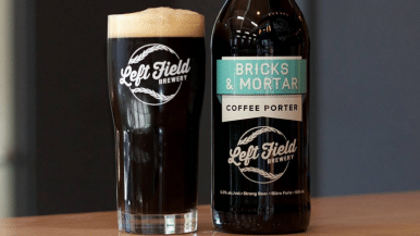
Great Lakes Brewery
Garnett Gerry, doodler

“Four years ago, I used to hang out and work at The Only Café. The bar manager, Fabian Skidmore, also happens to be GLB’s graphic designer. He asked me for a couple of drawings—I showed up the next day with six of them. One thing led to another, and eventually I was offered a full-time job. The LCBO has certain regulations and rules you have to get around, some of which seem contradictory to what you’re trying to do: you can’t have an image of alcohol within an alcohol-selling establishment. This means you can’t have anybody holding or drinking beer in an illustration!”
On his personal favourites
“I like Saison DuPump because it’s very Halloween-y and fun.”
“I really got to use my imagination for the Harry Porter label. I wasn’t inspired by the series—I wasn’t allowed to be because J.K. Rowling is notorious for suing people. On the back of the Harry Porter label it actually says, “To whom it may concern, don’t sue us.”
“Apocalypse Later is the ultimate in fun because I get to put all my different characters in a situation where they’re battling each other. I like to try to change up the design for that one at least once a year.”
Burdock Brewery
Adrian Farrow, artist

“I had a few friends that worked on the Burdock website. They mentioned to me that the Burdock team was looking for an artist to collaborate with, then passed my contact information along. One of my first labels for them was the West Coast Pilsner. I always like to set up rules for my process, as well as a concept that everything can hinge around, be it a colour palette, mood or atmosphere. With beer labels specifically, there’s less room; it’s a small canvas but I actually enjoy its ‘bite-sized’ quality. I think it’s fun to work with that limitation while trying to produce something eye-grabbing.”
On his personal favourites
“I really like the label for their Cuvée. It was really dynamic for a beer label to be so simple and graphic, and it was something that really distinguished us from other local brewers—and I really dig that.”
“Similar to the Cuvée is the IPA. It’s just so simple, you know? A lot of beers have these really overwhelming labels with lots of different information and textures and all these complicated things. I think there’s something beautiful about the simplicity of having just one or two colours and the most basic information.”
“Brett Lime was pretty progressive because it was the first in a series of square labels and it presented us a new format to play with. I’ve been using that form and pattern in some of my personal work for years, so on a whim I put it on the label. The response I got from Matt and Jason, Burdock’s owners, was so positive. They really thought the shape signified some emotive qualities of the beer.”
Henderson Brewing Co.
Tony Halmos, graphic designer and art director

“I had a pre-existing relationship with Henderson’s general manager, and the team knew early on that the funds for pulling together a visual identity weren’t going to be plentiful. They invited me to join and offered me a stake in the company, in addition to some compensation, so I’m also a part-owner of the business. Historically, Toronto is a city that often looks to other, larger metropolises for inspiration, but I think we’re coming into our own. We’re a young city growing into our confidence and I think that’s what makes our beer culture unique.”
On his personal favourites
“The recent Honest Ed’s Ides of January project was a joy. I almost didn’t even have to think about it—I knew what that label was going to look like, there was no research or development or anything. The label is kind of pilfering in a way, but I see it as a revisiting of an iconic part of Toronto.”
“We created last year’s Ides of June label in conjunction with Sweet Pete’s bike shop, and we used Tour de France imagery and Henderson colours. It looks like I’m only picking designs that have ties to real life, because sometimes some concepts are harder to put into images than others.”
“The Rademüller’s Refusal [centre] label from last year’s October Ides beer was inspired by the Gibraltar Point lighthouse—and a lighthouse keeper who may have been murdered there. I approached that one like a Toronto-based murder mystery story, and I made what I hope is a slightly sinister book cover–like beer label. All our Ides beers are an opportunity for storytelling—I know it sounds trite and clichéd but it’s definitely true.”
Indie Ale House
Dave Murray, illustrator

“A company called Nuvango purchased prints off of me a few years ago; they’re located just down the street from Indie Ale House. When Jason Fisher was opening Indie, just over four years ago, he went around to some of the local businesses, saw the art on the walls and asked, ‘Who’s that guy?’ It turned out to be me. There are a few other cities with growing craft beer cultures, but I think Toronto has been quicker to embrace the artistic side of the field. I think everyone sees value in the creative side of things; it’s not just about brewing a tasty beer, but also about using that process as a chance for expression.”
On his personal favourites
“At the top of the list so far is Glory and Consequences Belgian Dubbel. It was a funny image to do and it was also published in a separate illustration manual, so I’ve nothing but good things to say about that.”
“I did the bottle design for the Fates and Furies series—their limited edition line of barrel-aged beers—and I got to design both the miniature champagne-style bottle and the wraparound artwork, text and all.”
“The Couch Surfer IPA is another one I had a lot of fun making—obviously, the visual pun of a guy loafing around on a couch but still surfing on a big wave is cool, but even colour-wise, I used a palette I don’t typically use. It definitely had a more tropical feel to it.”